Project Overview
Timeline
Team
Role
Tools


Problem Statement
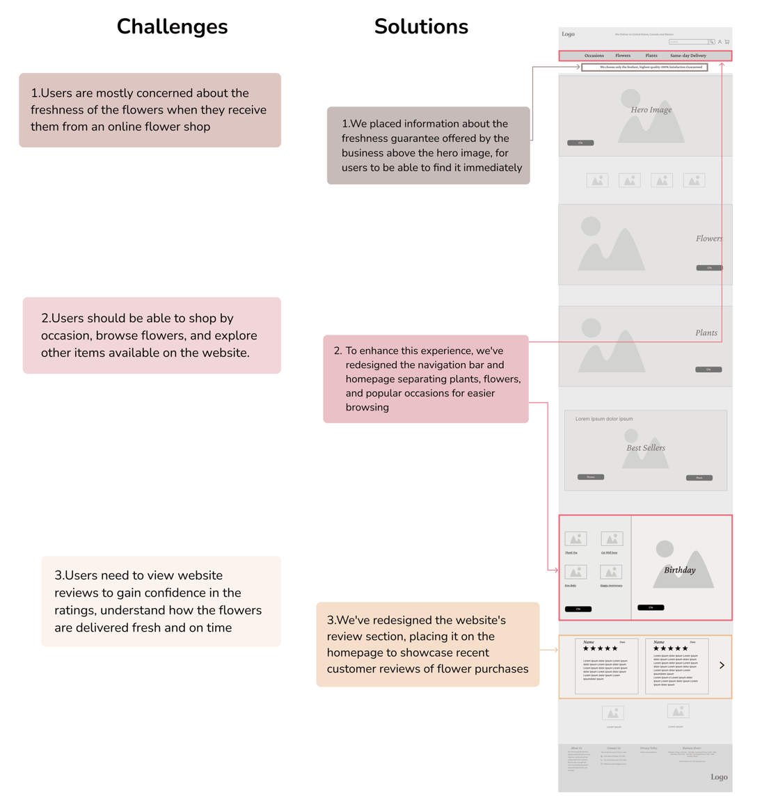
Navigation Issues: Users struggle to navigate the website efficiently, leading to difficulties in finding and selecting desired products.
Incomplete Purchases: The poor user experience often results in potential customers abandoning their shopping process before completing a purchase.
Low Customer Numbers: The current number of customers is less than expected, highlighting a gap between business goals and actual performance.
Product Offering Visibility: The website fails to effectively showcase the business's wide range of products and services, making it difficult for users to understand their full offerings.
To address these issues, the business is considering a complete website redesign.
Redesign Process


Heuristic Evaluation


Home page
Category page
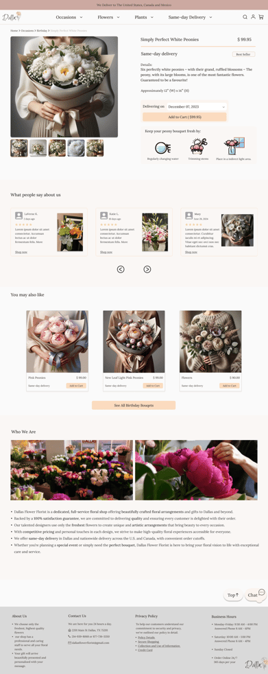
Product page
Checkout
Home page
Survey


Birthdays and anniversaries are the most popular occasions for buying flowers. In response:
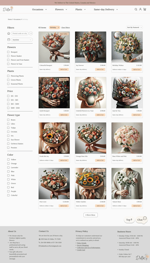
we've made these categories more accessible and noticeable in the navigation bar .
We've also placed these occasions as the first option in the filter.
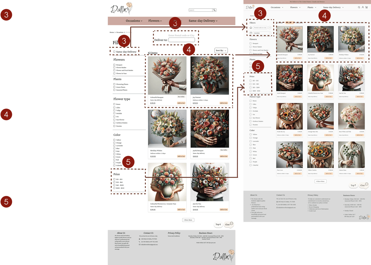
Price and high-quality images are top priorities for customers. To address this:
We've implemented a price filter to help customers easily find products within their budget.
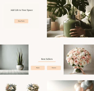
With the business allowing us to take charge of this section, we've provided insights on how the flower photos should be presented, ensuring that clear, high-quality images are displayed with the help of AI to generate the website photos.
Interview
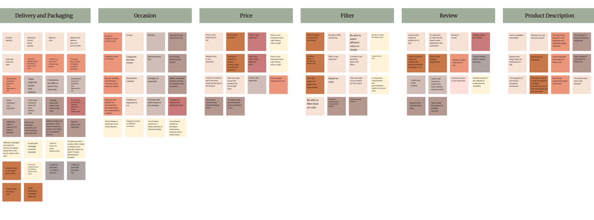

In the next step of redesigning the flower online shop website, we conducted interviews with 9 individuals. Our goal was to identify their pain points and crucial factors involved in these processes by inquiring about their past experiences and preferred methods for purchasing flowers online.
Key Takeaways:
Prioritize delivery and packaging: This is the most critical aspect and should be the primary focus.
Categorize by occasion: Flowers should be organized based on different occasions for easier selection.
Provide filters: Include options for customers to filter flowers based on their specific needs and preferences.
Transparent pricing: Ensure that prices are clearly displayed and easy to find.
Highlight reviews: Make customer reviews readily accessible.
Include detailed descriptions: Offer comprehensive information, including care instructions, longevity, and size of the flowers.
Competative Analysis
We performed a competitive analysis to identify key areas where our website can improve and gain insights from competitors.


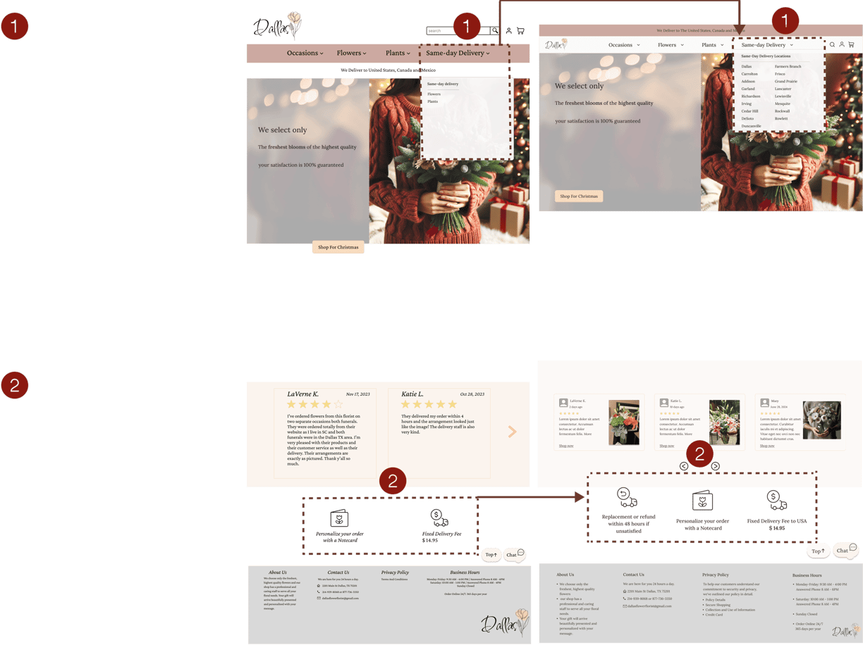
We also noticed that businesses offering same-day delivery often feature this option separately in the navigation bar, so we've implemented this approach on our website as well.
Story Board
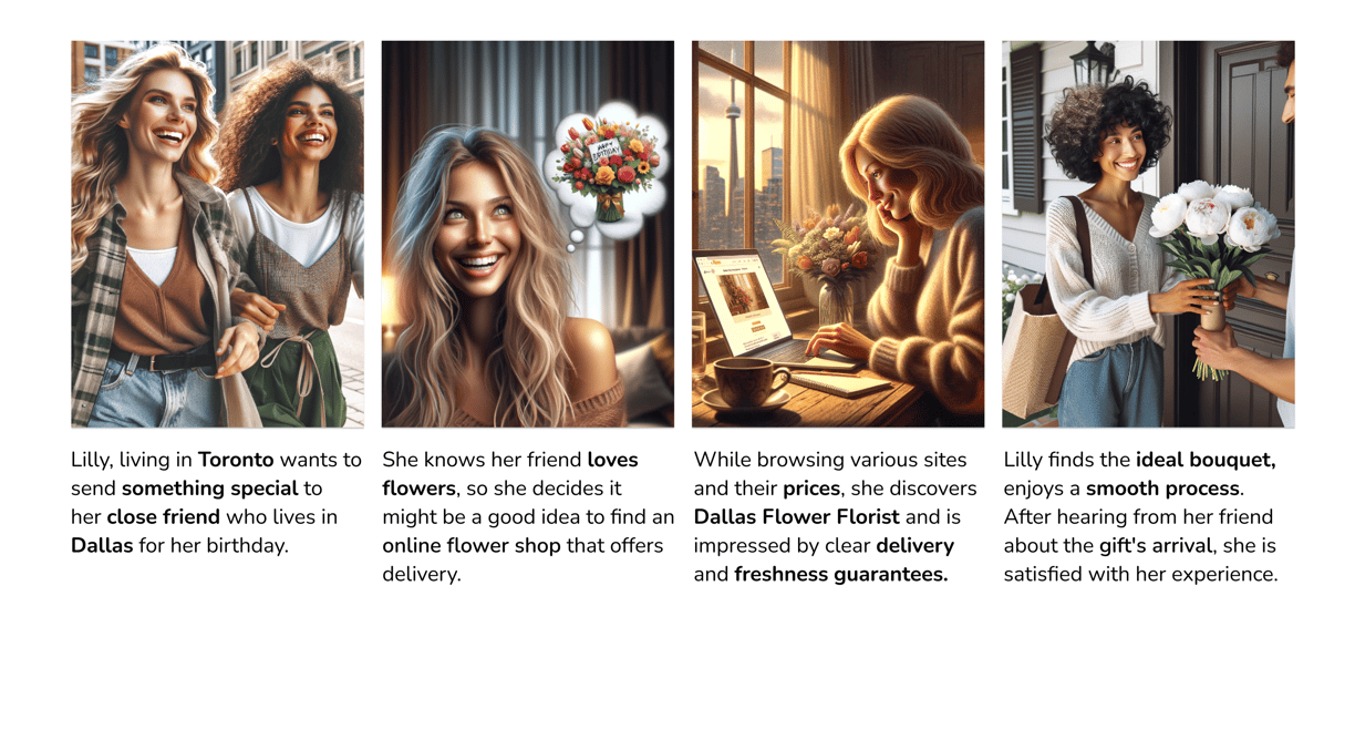

Lilly's primary concerns are finding a range of price options for bouquets, along with a trustworthy service that guarantees fresh flowers and timely delivery.
Persona


Sitemap
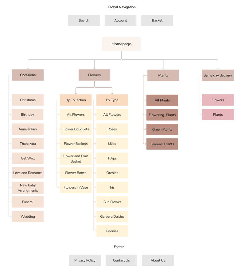

Userflow
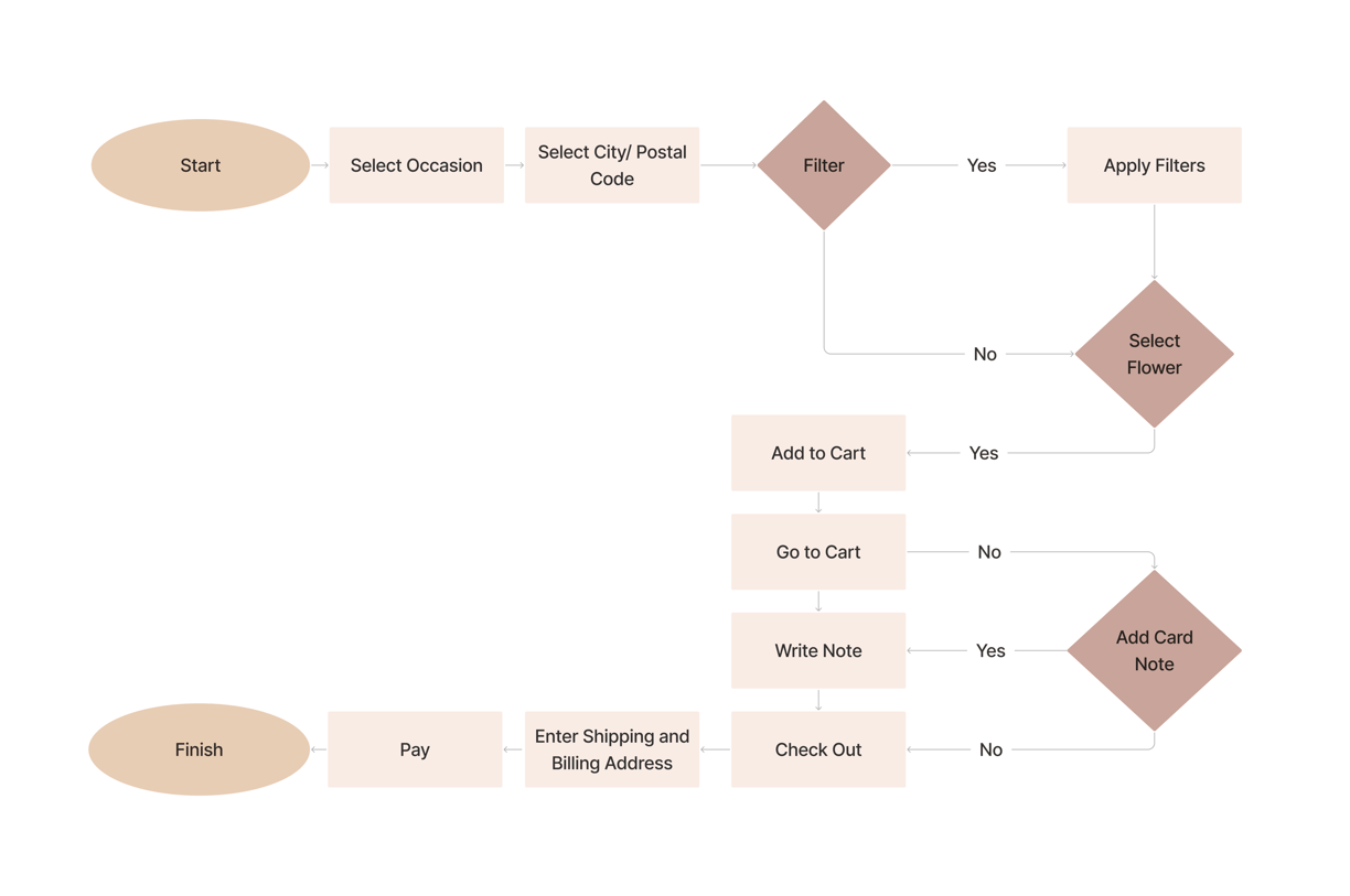

Develop


Sketch


Low-Fidelity
Mid-Fidelity


Mood Board-UI Kit


High-Fidelity

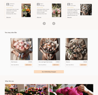
Usability Testing-Iteration
