

Project Overview
Timeline
Team
Role
Tools


Business Goals
Enable users to customize their furniture by fabric, color, size, etc.
Implement augmented reality (AR) features to verify product size and color
Encourage users to shop for their furniture online with confidence
Target Users
Individuals who prioritize sustainability and eco-friendly products in their purchases.
People looking to furnish their homes, particularly those who enjoy customizing their space to reflect their personal style.
individuals who are not interested in shopping for furniture online, aiming to understand what keeps them from doing so.
Design Process
Our team of four followed a Double Diamond approach based on the Design Thinking methodology. The process wasn't linear; we frequently moved between stages as the project evolved
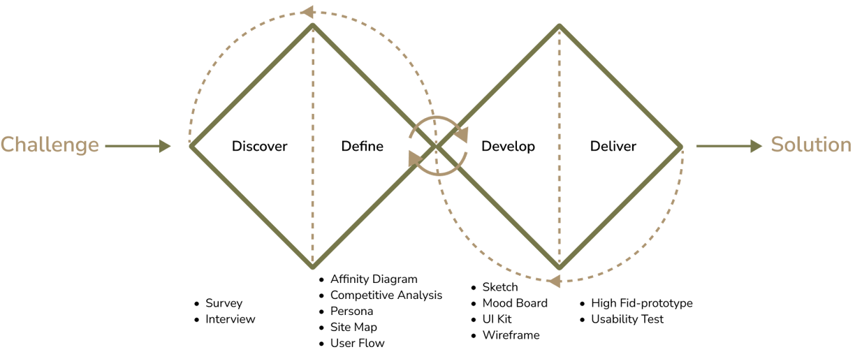
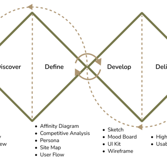
Discover
To understand the user's pain points and develop effective solutions, we employed a comprehensive research approach that consisted of the following methods:
Survey
Interview
Competitive analysis
Survey
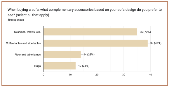
To gain a deeper understanding of user preferences, we conducted a brief survey and gathered insights from 50 respondents. Here are the key findings:
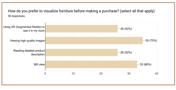
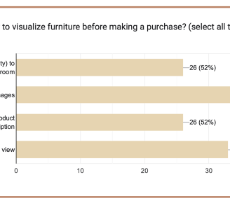
Improved Visualization Features:
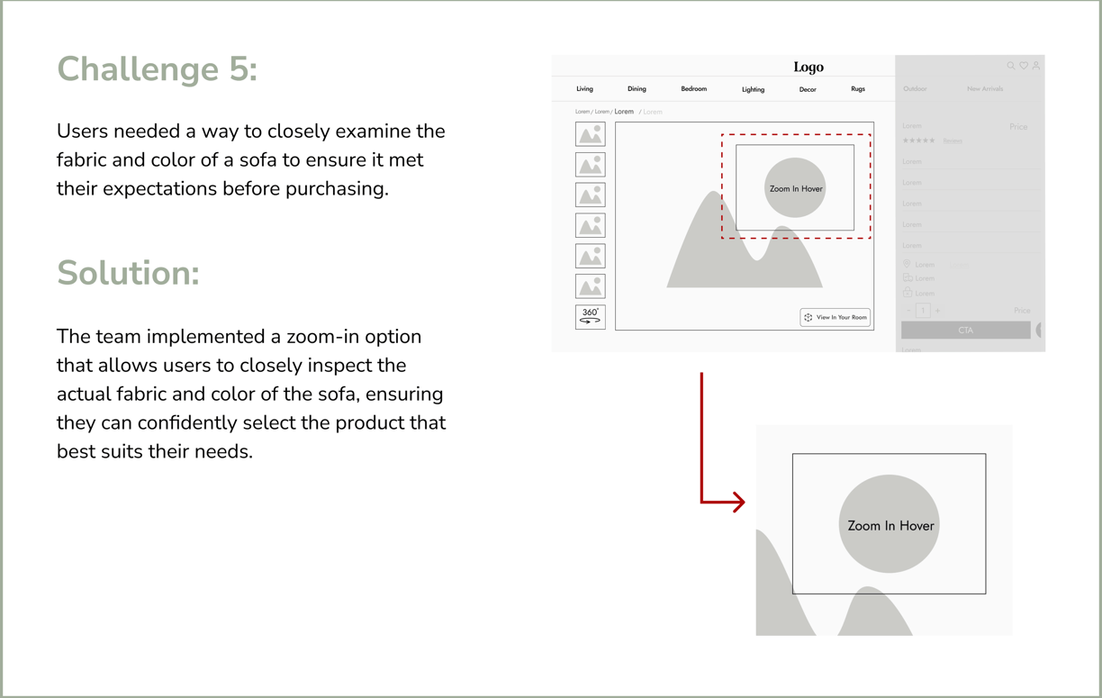
Use high-quality images with a zoom-in feature to allow users to see the material details.
Place the 360-degree view option where users can access it easily, enabling them to visualize the furniture from all angles.
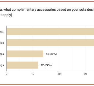
Complementary Accessories Display:
Show preferable items that match the sofa product, such as coffee tables, side tables, and cushions.
Interview
In our research, we interviewed 13 people to understand their needs and preferences for online furniture shopping.
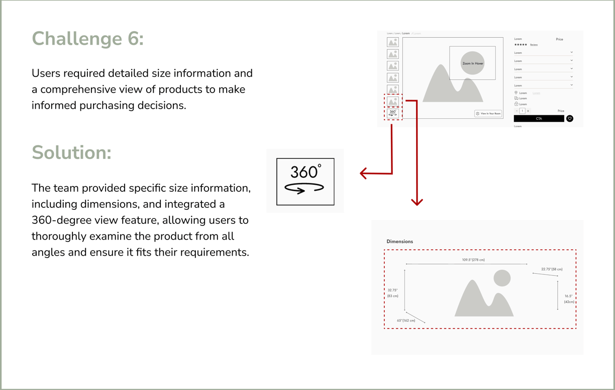
Key findings include the importance of accurate product categorization and filters (color, price, size) for ease of browsing. Users emphasized the need for dimensions in both inches and centimeters, detailed 3D AR visuals, images, and descriptions.
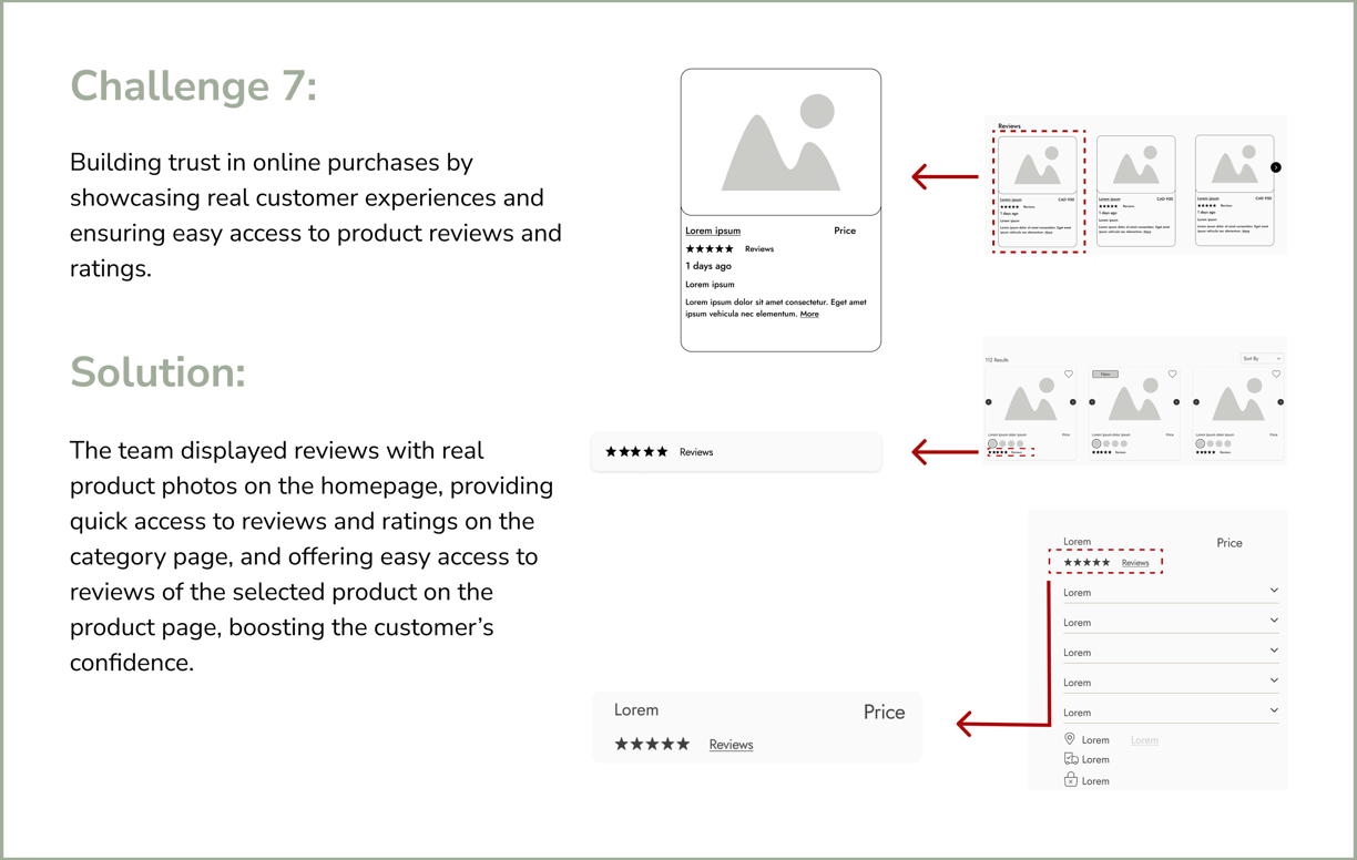
Customization options (legs, fabric, sizes) should be prominently displayed on the landing page. Reviews, high-quality images and allowing zoom-in on fabric details, are crucial for building user trust and influencing purchasing decisions.
Define
Affinity Diagram
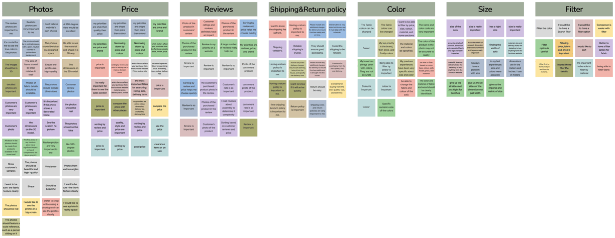
Some quotes mentioned by people in interviews:
"Categorizing products by room type and furniture type helps me navigate better."
"I prefer to quickly narrow down my choices using filters for price and color."
"Having precise dimensions, high-quality images, and zoom features is crucial. I want to see the fabric, color, and texture up close."
"Customer ratings and reviews are crucial influences my purchasing decisions."
Competitive Analysis
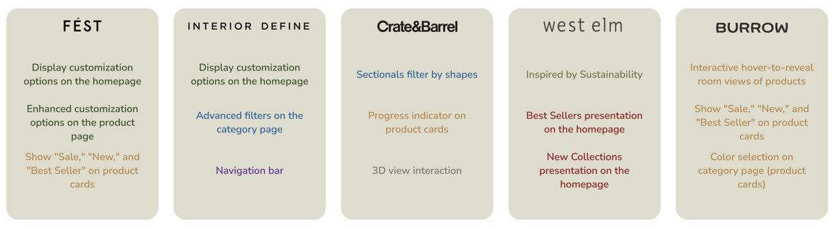
We analyzed 5 similar websites, studying their features and workflows. This research enabled us to create a more effective information architecture, incorporating elements inspired by their designs.
Below, the identical colors represent similar features that we examined across these websites.
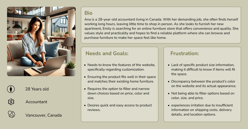
Persona
The insights we gathered from our research led to the development of the persona. Our main goal was to highlight the patterns and pain points that surfaced, enabling us to better empathize with the users.
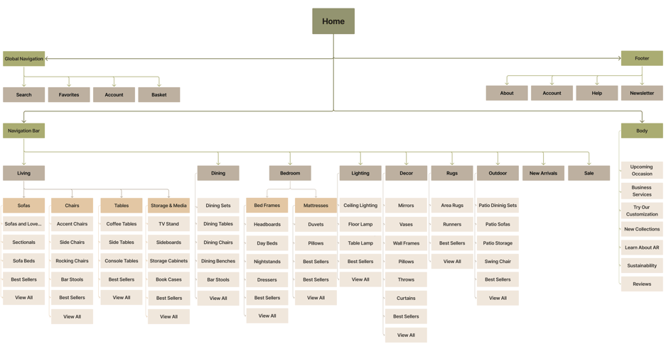
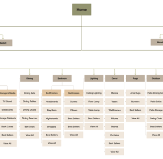
Sitemap
By doing card sorting, we learned how to organize different sections of our website and made the first version of our site map. However throughout the design process, user testing and the competitive analysis, the final version of the site map was built.
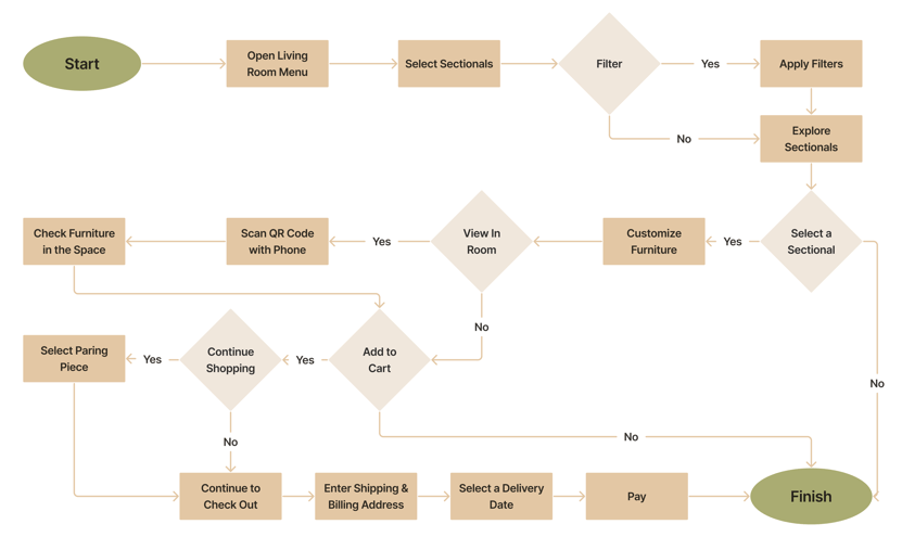
User Flow
By doing card sorting, we learned how to organize different sections of our website and made the first version of our site map. However throughout the design process, user testing and the competitive analysis, the final version of the site map was built.
Develop
After analyzing our research data and understanding user needs, we developed solutions to address their concerns and incorporated them into our design.
Sketch
We initially mapped out our ideation using hand-sketched low-fidelity wireframes, aiding communication within the team during the early design stages. Later, we transitioned to creating mid-fidelity wireframes on Figma to visualize page layouts and design direction. These wireframes went through multiple iterations before finalizing the content.
Low-Fidelity
Mid-Fidelity
Mood Board
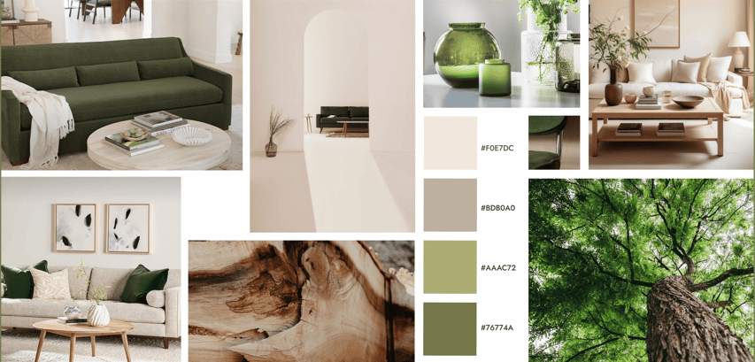
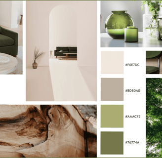
To design a high-fidelity interface, we begin by crafting a mood board that captures the primary objectives and desired emotions as defined by stakeholders. This process helps us set the visual direction and overall aesthetic for the interface.
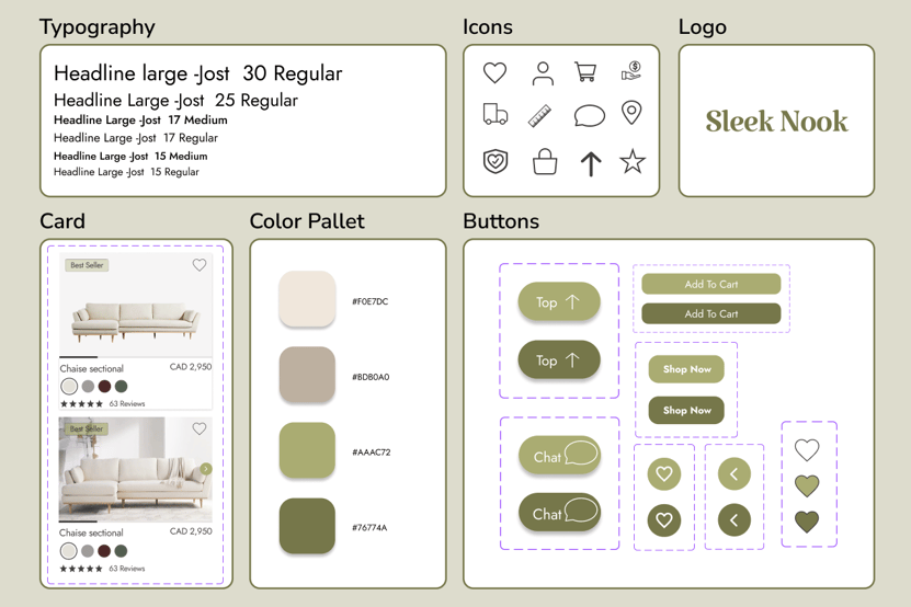
UI Kit
Deliver
Throughout the project, we went through multiple iterations, driven by the insights we gained from usability tests. These tests were instrumental in shaping our decisions and constantly enhancing our project.
Usability Test and Iteration
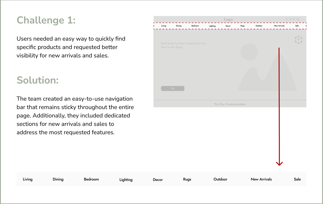
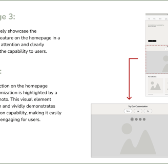
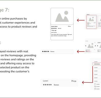
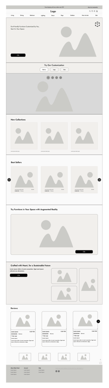
Users frequently overlooked the upcoming occasion, missing it entirely. To increase visibility and capture their attention, we moved it to the hero image, making it a more prominent and engaging feature
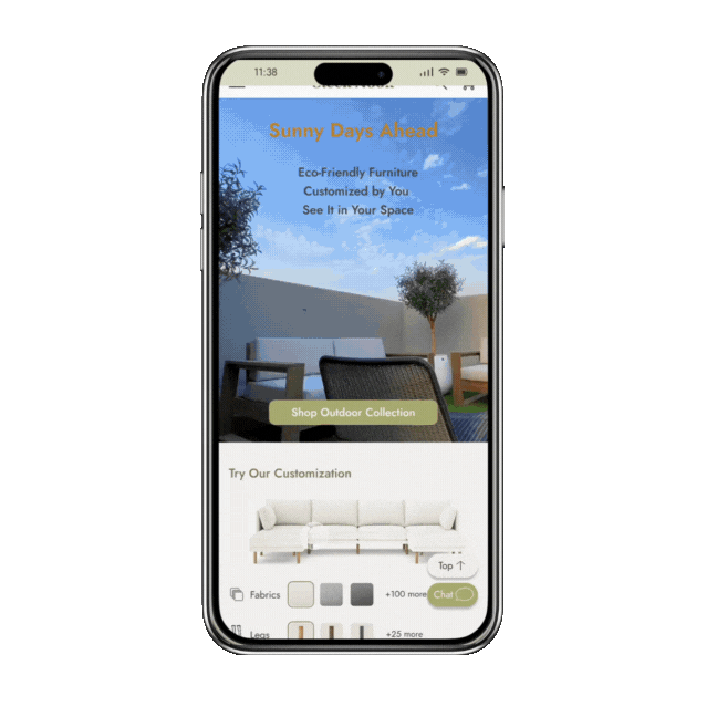
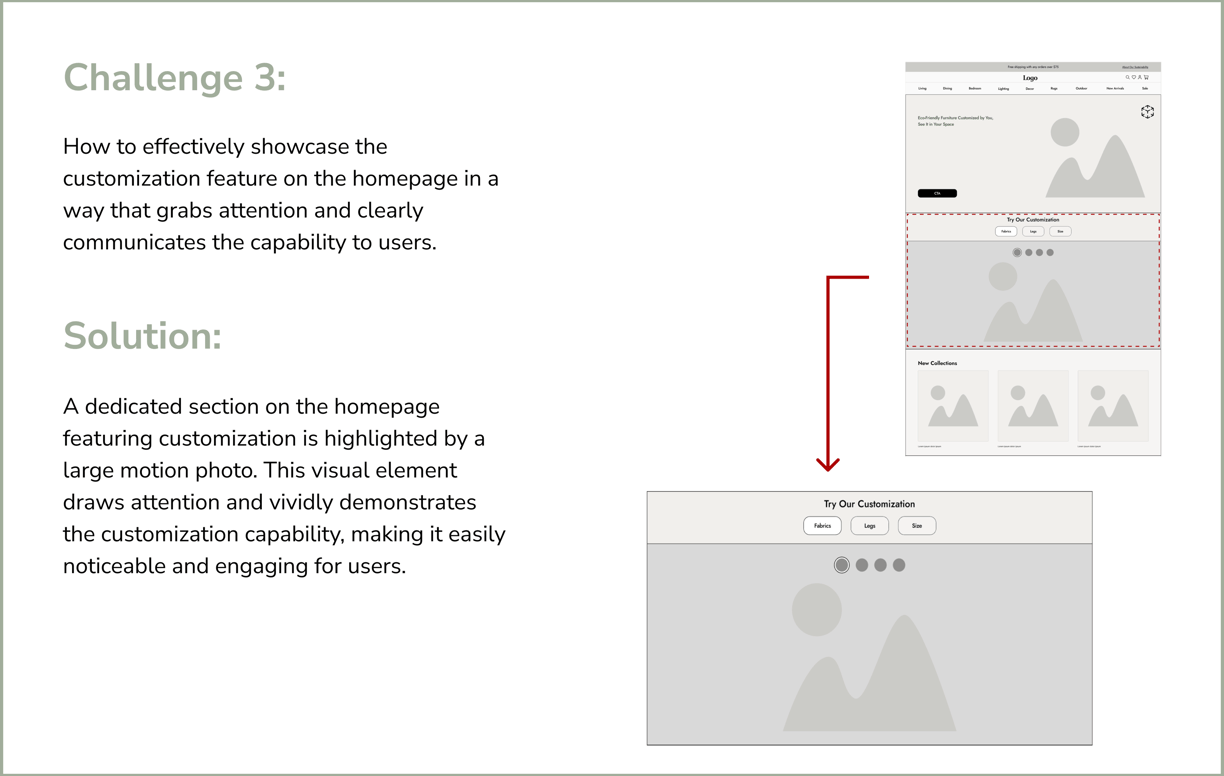
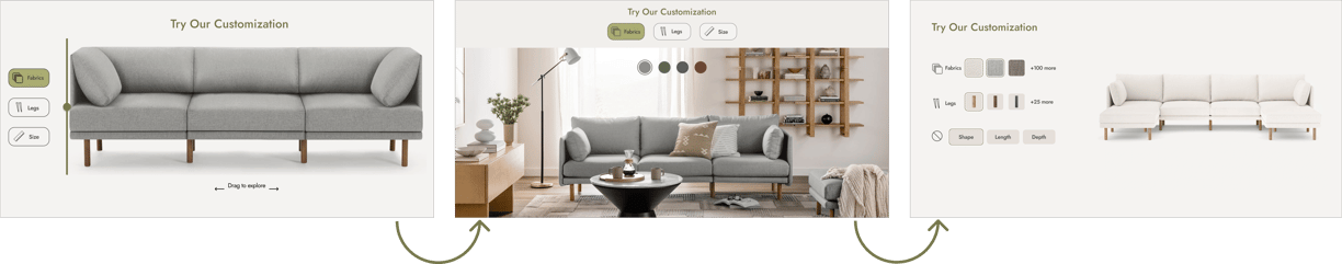
Users initially struggled to recognize the slider's function for customizing the sofa and preferred using buttons. Even after guidance, they found the slider challenging. To improve usability, we introduced a dynamic image that updated automatically when buttons were clicked.
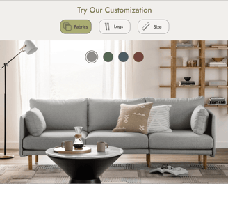
Users initially mistook fabric colors for buttons, struggling with the dynamic autoplay. To improve clarity, we enabled interactive clicks for real-time changes and added customization details, making the feature more intuitive and engaging.
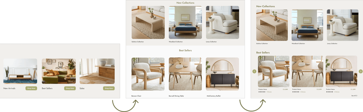
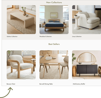
Users struggled to recognize separate sections. To improve clarity, we created distinct sections for new collections and best sellers while moving the sale section to the navigation bar for easier access, aligning with user preferences.
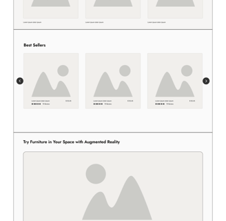
To meet user preferences, we added a slideshow showcasing best sellers with prices and ratings, eliminating the need for extra navigation.
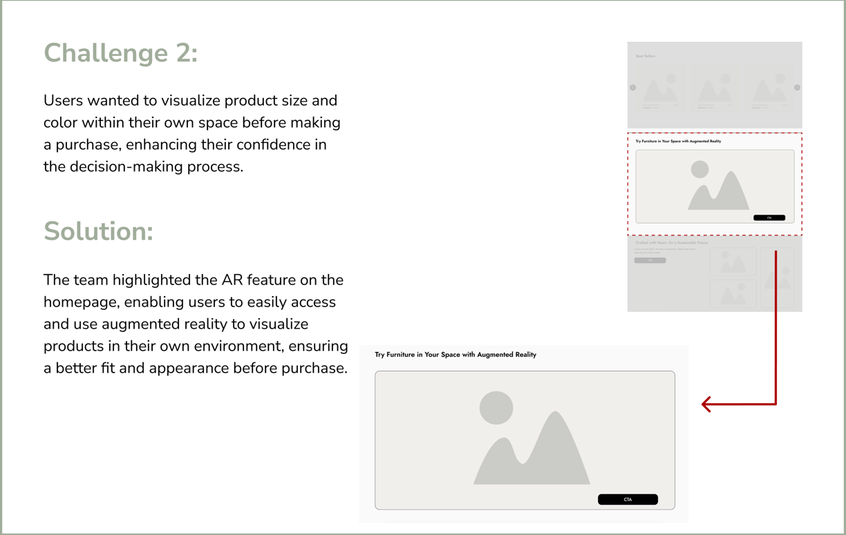
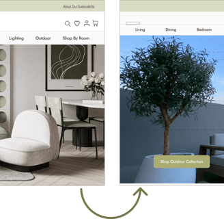
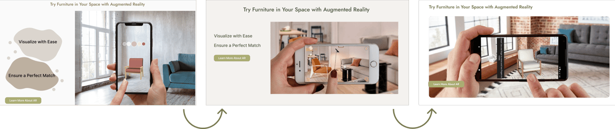
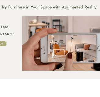
This frame, showing the AR option, was difficult for users to understand as interactive, allowing them to move and zoom in/out on the mobile screen. We then replaced it with a photo of a mobile screen, showing someone using the feature to try a piece of furniture in their space.
We noticed that users didn't understand the AR feature when it was applied to a small object (the floor lamp). To make it easier for them to grasp, we switched to a larger piece of furniture (a chair).
Since users need to see the icons for shipping, finance, and warranty as soon as possible, we moved them higher on the homepage.
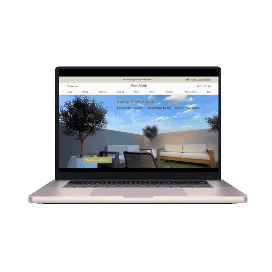
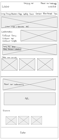
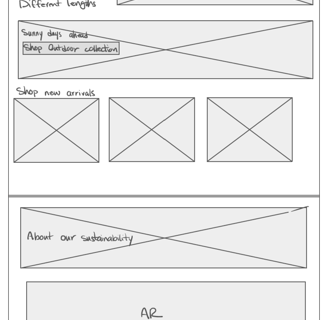
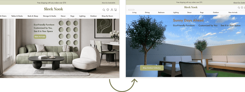
Home Page
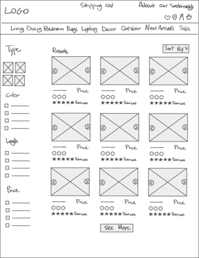
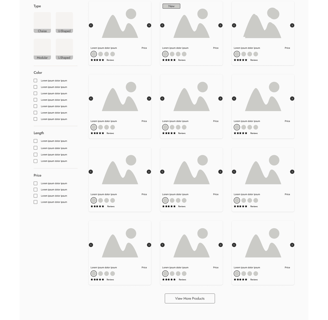
Category Page
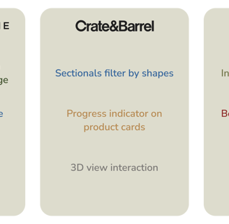
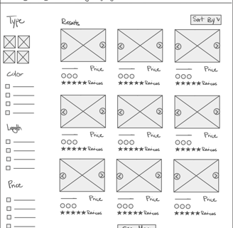
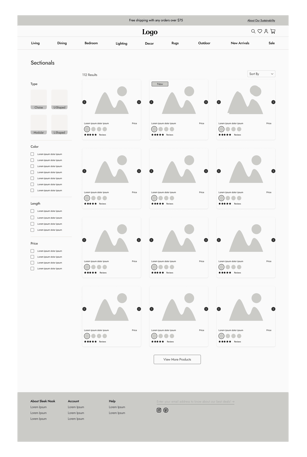
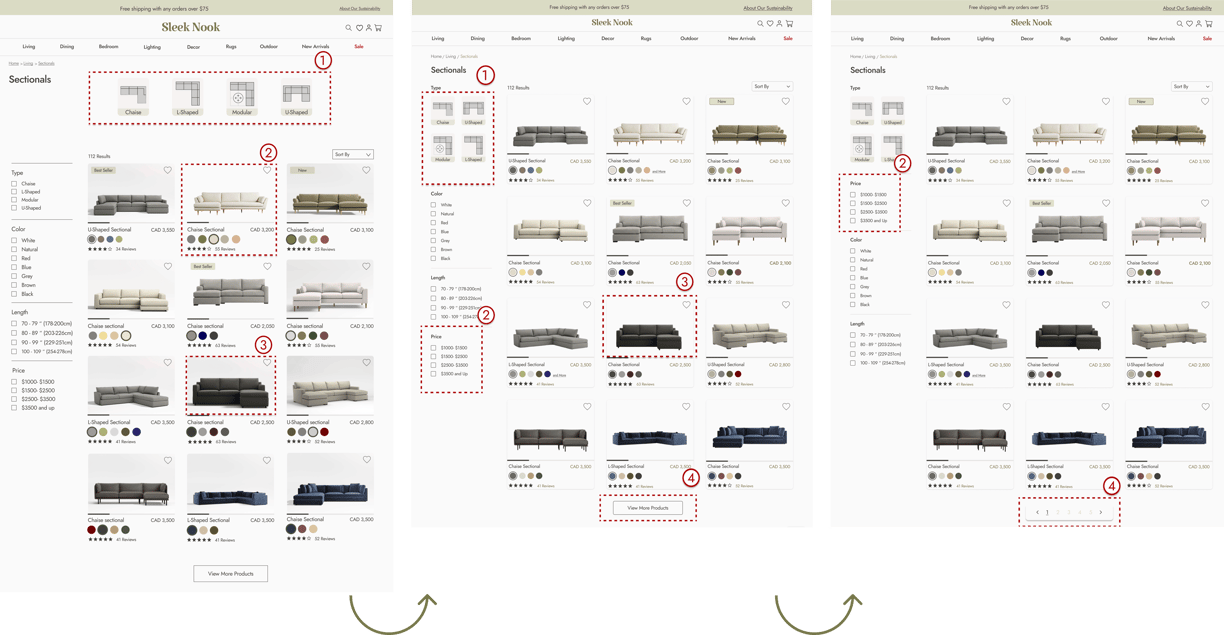
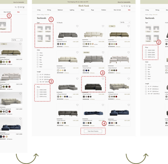
We moved the 'sectionals' type to the filter menu instead of keeping it at the top of the page because users didn't realize they were clickable and selectable.
Users wanted to find the price option more quickly, So, we moved the price option to the beginning.
We removed the background to achieve a more modern, minimalist look.
Our users preferred to know how many pages are available and which page they are on, so we changed the "View More Products" button and updated the feature to indicate the total pages and guide them directly.


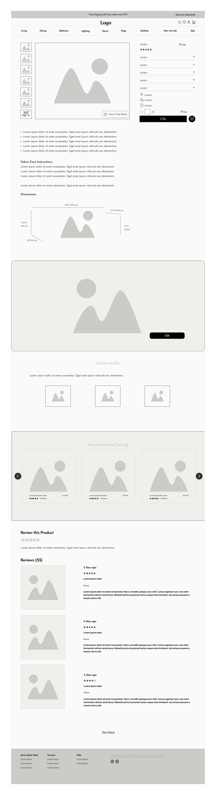
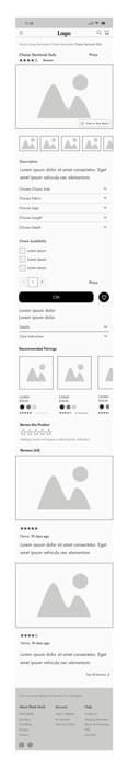
Product Page
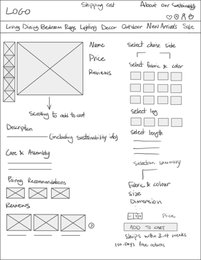
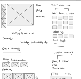
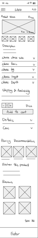
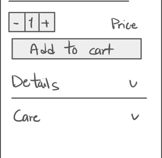
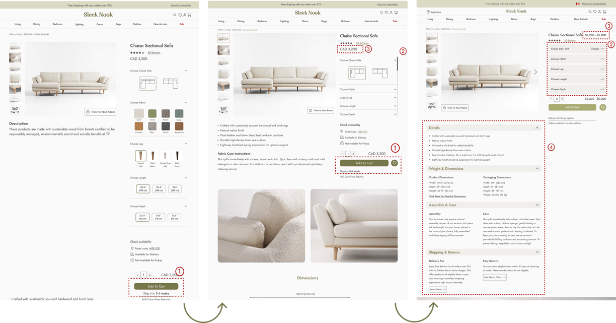
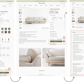
Users could only find the "Add to Cart" button at first, requiring them to scroll down the page. To improve this, we decided to close the customization card, making the "Add to Cart" button more quickly accessible.
Users found it difficult to open and close each section on the product page for customization. To improve this, we updated the design so that when they select a customization option, an overlay opens, allowing them to navigate freely and customize their sofa.
When users applied customization, they assumed the price was fixed and wouldn’t change. To clarify, we displayed a price range, showing the minimum and maximum prices, to indicate that the cost adjusts based on their customization choices.
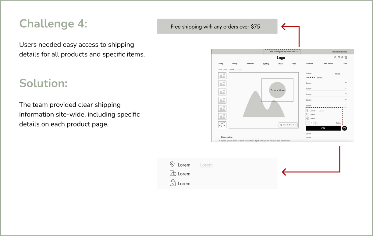
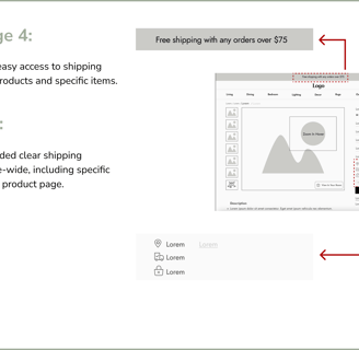
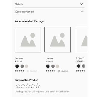
Users expressed a preference for having all key information, such as care instructions, return policy, and materials, displayed together and readily accessible. In response, we consolidated these details beneath the product images for easier visibility.